How to Choose Christmas Light Colors for a Stunning Display?
We choose Christmas light colors by matching the palette to our home’s exterior materials, architectural style, and preferred holiday mood. We create a balanced display with consistent white tones, a clear focal point, and an after-dark curbside check. This check helps us confirm that the roofline, landscaping, and entryway work together.
Key Takeaways
- We use our home’s siding, brick, stone, trim, roof, and front-door colors as the foundation for the lighting palette.
- We choose warm white for brick, stone, and warm neutral exteriors. Cool white often suits gray, white, black, and modern homes.
- We start with one dominant color and one accent color. This approach creates a coordinated display without visual clutter.
- We keep the same white color temperature across rooflines, trees, pathways, wreaths, and other décor.
- We test a small section after dark from across the street. This step confirms brightness, contrast, and overall balance.
Choose a Color Palette That Fits Your Home and Holiday Style
There’s no single best Christmas light color combination for every home. The right palette depends on exterior colors, architecture, existing décor, the mood we want to create, and how the display appears from the street.
Learning how to choose Christmas light colors starts with the home’s fixed features. We should look at siding, brick, stone, trim, shutters, roofing, and the front door before selecting a single strand. Colorful shutters or a bold front door deserve special attention. Lighting should complement these features instead of competing with them.
For a simple framework for how to choose colors for Christmas lights, we recommend these steps:
- Start with the home’s permanent exterior colors.
- Choose a mood: traditional, warm, elegant, playful, wintery, modern, or bold.
- Select one dominant color and one accent color, unless we want a coordinated multicolor plan.
- Choose either warm white or cool white as the base white tone.
- Test a small section after dark before completing the installation.
This approach makes choosing Christmas light colors easier and helps prevent a display from looking random. It’s especially useful in Portland, Oregon, Vancouver, Washington, and nearby Pacific Northwest communities, where curb appeal and wet-weather installation conditions both deserve careful planning.
Match Christmas Lights to Exterior Colors, White Tones, and Décor
Warm white creates a soft golden glow. It feels traditional, welcoming, and familiar. This option often suits brick, stone, tan, beige, brown, cream, and other earthy exteriors.
Cool white produces a crisp, bright, icy appearance. It has a more contemporary feel and often pairs well with gray, white, black, blue-toned, and modern exterior palettes.
The key is consistency. We should use the same white color temperature across rooflines, wreaths, trees, pathways, garlands, and entry décor. Mixing warm-white and cool-white strands is a common mistake because the display can look unplanned, even when each individual product looks attractive.
Brick, stone, tan, cream, brown, and warm neutral homes often look excellent with warm white, red, amber, or classic red-and-green displays. White, gray, charcoal, black, and modern homes can support cool white, blue, icy blue, or a clean warm-white-only layout.
Landscaping and décor also affect the final result. Evergreen trees, red berries, pathway decorations, wreaths, porch décor, and front-door accents should support the same visual direction. A warm white and red design, for example, works naturally with traditional greenery and red ribbon. Cool white and blue may better suit silver, white, or winter-themed decorations.
A useful visual comparison shows warm white and cool white on brick, gray siding, and a modern black-and-white exterior. The difference is often much clearer after dark than it is in a product photo.
Popular Christmas Light Color Combinations and When to Use Them
These combinations offer reliable starting points instead of vague advice to simply choose favorite colors.
| Color Combination | Best For | Mood | Exterior Pairings | Tips to Keep It Balanced |
|---|---|---|---|---|
| Warm white + red | Classic holiday displays | Welcoming and traditional | Brick, neutral siding, classic homes | Use white along the roofline and red as an accent. |
| Warm white only | Polished, flexible décor | Elegant and timeless | Most exterior colors | Carry the same tone through the full display. |
| Cool white + blue | Contemporary winter displays | Crisp and modern | Gray, white, black, modern exteriors | Keep blue concentrated at focal points. |
| Red + green | Traditional Christmas styling | Bold and nostalgic | Neutral or warm-toned homes | Follow a clear pattern to avoid visual clutter. |
| Red + warm white + green | Full traditional displays | Festive and balanced | Brick and classic architecture | Let warm white act as the neutral base. |
| Blue + white | Winter wonderland themes | Snowy and bright | Cool-toned homes | Use one consistent white temperature. |
| Multicolor | Playful family displays | Cheerful and energetic | Most homes with a deliberate layout | Repeat colors across the display instead of adding them randomly. |
| Warm white + gold/amber | Refined holiday décor | Soft and upscale | Warm-toned exteriors | Use subtle accents rather than intense color blocks. |
| Purple + blue or purple + cool white | Distinctive modern designs | Whimsical and contemporary | Modern homes and architectural accents | Use selectively on gables, columns, or entry features. |
Many Pacific Northwest homeowners prefer warm white for timeless curb appeal or cool white and blue for a clean winter look. Still, exterior materials and personal style should guide the final choice.
How Many Colors to Use and Where to Place Them
We recommend starting with one dominant color and one accent color. A multicolor display can also work well, but it needs an intentional pattern across the roofline, landscape, and entryway.
Several unrelated saturated colors can compete for attention. The result often looks busy rather than festive. A clear visual hierarchy solves that problem.
Roofline lights should serve as the visual anchor. Trees, shrubs, pathways, columns, and entryways should support the primary design instead of overwhelming it. We should select one focal point, such as the roofline, front entry, large evergreen, or architectural gables, rather than decorating every surface equally.
Large homes usually need more visual consistency across broad rooflines and landscape areas. Smaller homes can look crowded quickly, so a limited palette and fewer focal areas often create a stronger display.
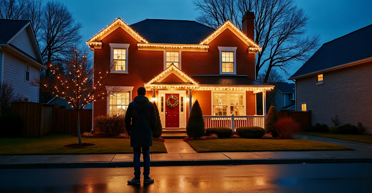
Colors also change from the curb. We should test a small section after dark, then view it from across the street or the end of the driveway. This reveals brightness, contrast, balance, and whether the colors work with the home as a whole.
Common issues include using too many competing colors, ignoring siding or roof color, treating every surface as a focal point, judging lights only in daylight, and mixing warm-white with cool-white strands.
Why Programmable Permanent Lighting Makes Color Selection Easier
Permanent lighting makes it easier to test and adjust a Christmas palette without buying and reinstalling separate seasonal strands. App-controlled LED systems can preview warm white, cool white, red, blue, multicolor effects, and custom color combinations along the roofline.
That flexibility supports Christmas displays as well as Halloween, game days, birthdays, and everyday exterior accents. Scheduling also allows the display to run at preferred times while helping maintain a clean, consistent roofline appearance throughout the year.
For homeowners who want flexible holiday color options without recurring ladder work, our permanent holiday lighting service offers a polished local solution. We can also help shape the visual plan through exterior lighting design that fits the home’s architecture and curb appeal.
Outdoor Safety, Final Checks, and Homeowner FAQs
Outdoor lighting needs safe products and installation practices, particularly during wet Pacific Northwest conditions. We should use outdoor-rated lights, weather-appropriate connections and extension cords, avoid overloading circuits, and follow manufacturer instructions. Difficult rooflines, elevated areas, and wet-weather installation conditions may call for professional help. This guidance doesn’t replace electrical guidance or manufacturer instructions.
Before completing the display, we should confirm that all white lights use the same temperature, the palette complements siding and landscaping, and the roofline remains the visual anchor. A final after-dark street view helps verify balance. We should also inspect outdoor connections, circuit capacity, and cable placement.
Christmas Light Color FAQs
What are the best Christmas light colors for a house?
Warm white, warm white with red, cool white with blue, and coordinated multicolor layouts are dependable choices. The home’s exterior palette should determine the final direction.
Should we use warm white or cool white Christmas lights?
Warm white usually suits brick, stone, and warm neutrals. Cool white often fits gray, white, black, and contemporary homes.
How many colors should we use for outdoor Christmas lights?
One dominant color plus one accent color is an effective starting point. Multicolor displays work best with a repeated, planned pattern.
Do red and green Christmas lights look good together?
Yes. Red and green create a bold, nostalgic Christmas appearance when arranged in a clear pattern with enough visual breathing room.
What Christmas light colors look best on a gray house?
Cool white, blue, icy blue, and restrained warm white displays can all work well on gray siding.
What Christmas light colors look best on a brick house?
Warm white, red, amber, and classic red-and-green schemes often complement brick especially well.
Can permanent outdoor lights change colors for Christmas?
Many app-controlled permanent lighting systems can switch colors and run custom patterns for Christmas and other occasions.
Portland and Vancouver homeowners who want help visualizing a Christmas palette can request a free consultation from Permanent Lighting PDX through our lighting consultation page.